

1Up Events
Desktop Website Redesign
Project Summary
problem
1Up Events is a creative & unique online solution to the common stress that surrounds planning a party end-to-end. But their unique hybrid business model proved a challenge when creating a simplified user flow & logical information architecture.
Solution
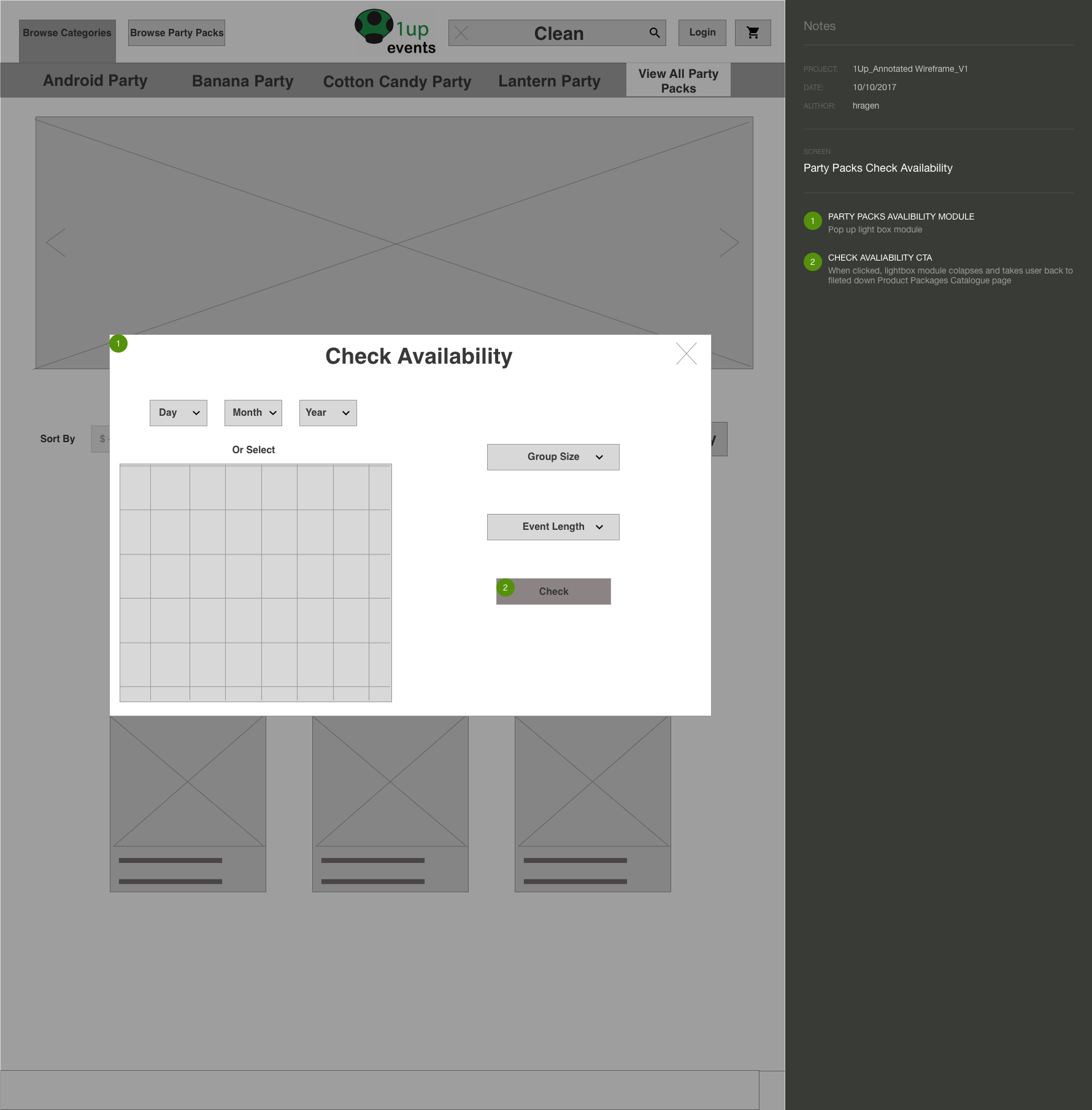
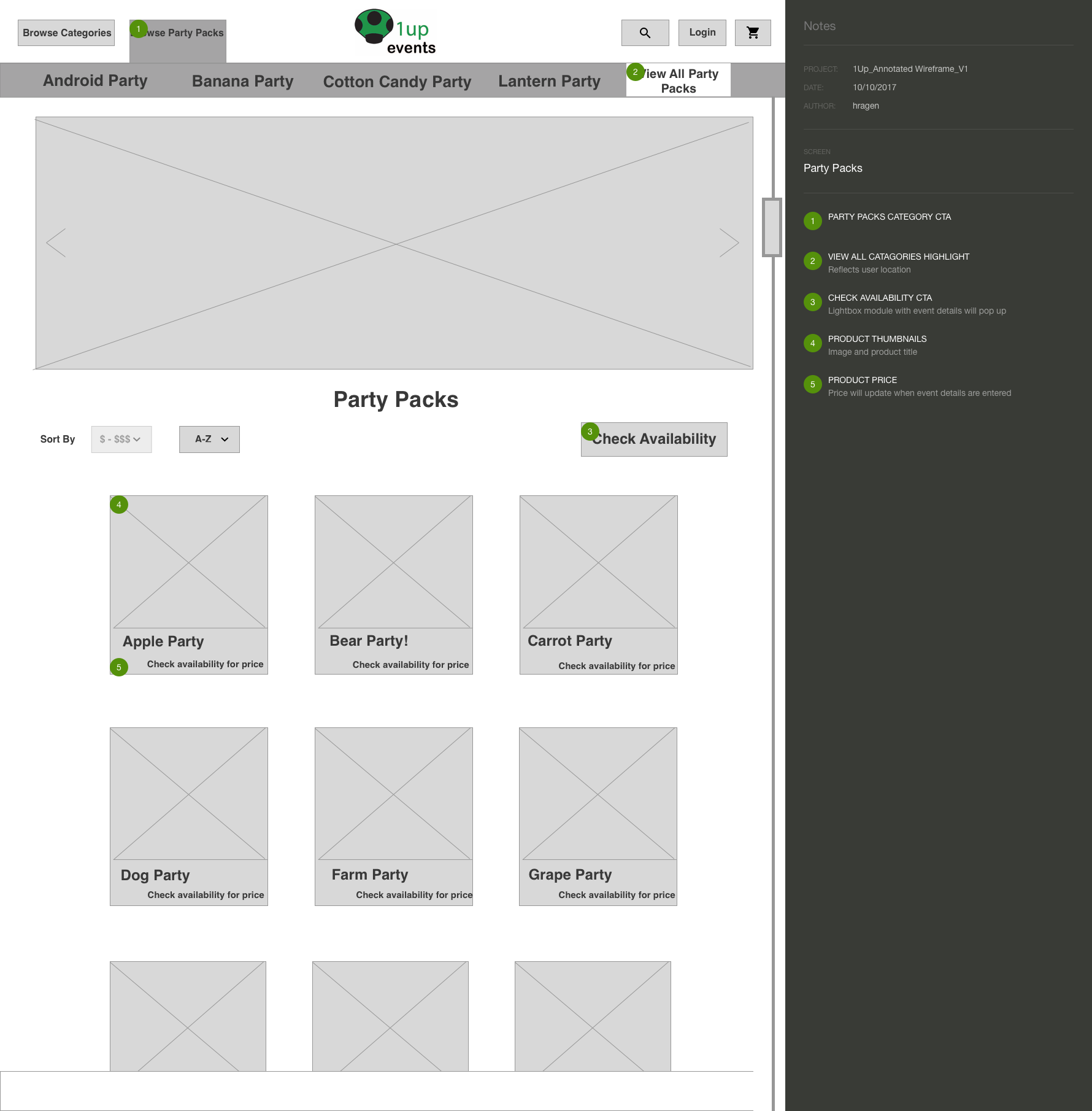
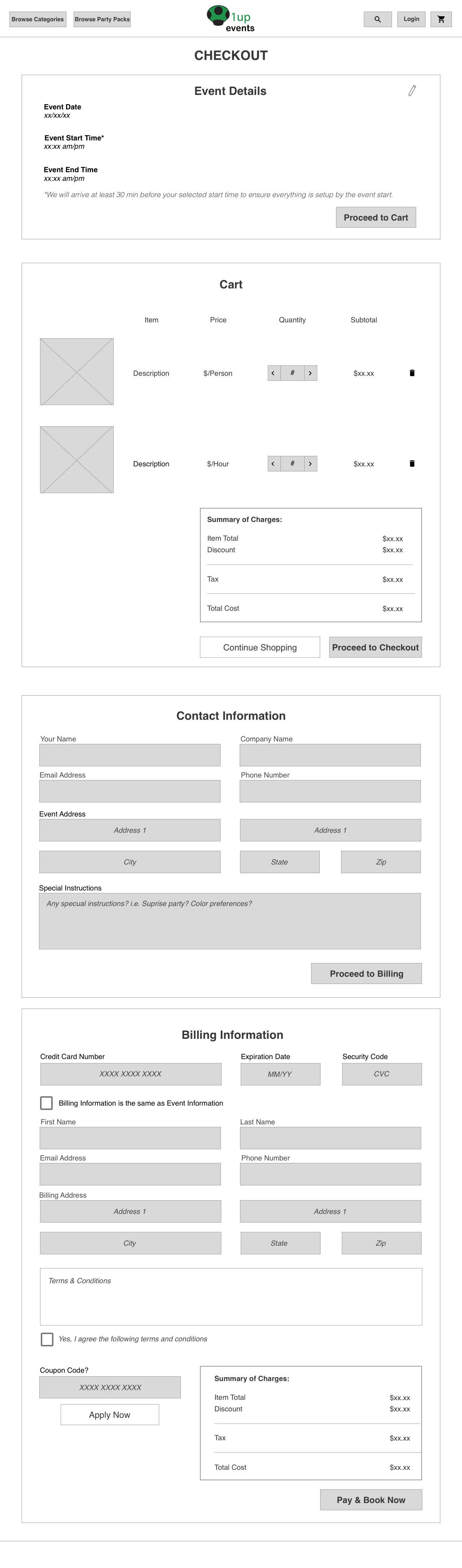
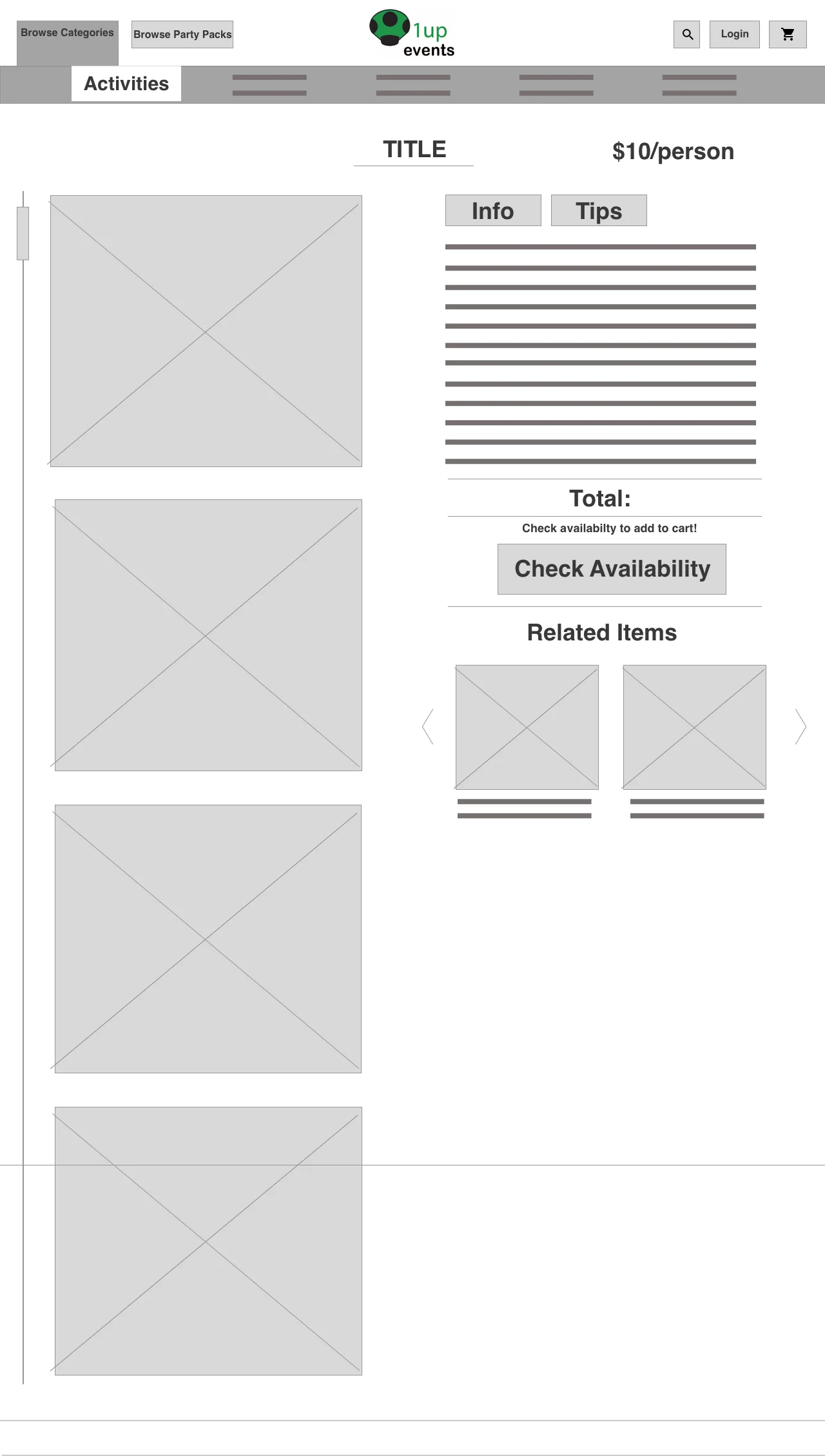
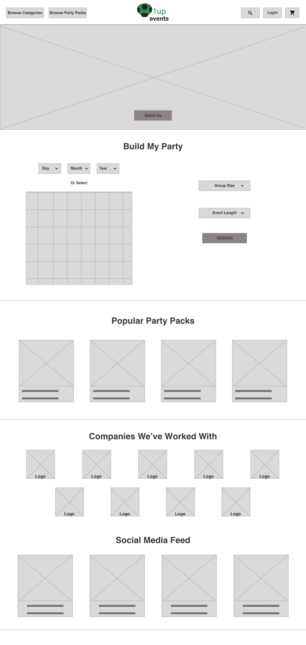
I provided a website redesign that would increase product discoverability & simplify user checkout flow in order to decrease user drop off rates & increase multiple product bookings in a single transaction. I simplified the user check outflow by creating an "availability" module and reorganizing product categorization.
Timeframe
3 Weeks
Team
Devin Harnett
Rosana Jimenez
Role
User Researcher
Information Architect
Interaction Designer
Content Strategist
Deliverables
Research Report
Site Map
Wire Frames & User Flows
Annotated Wireframes & Mockups
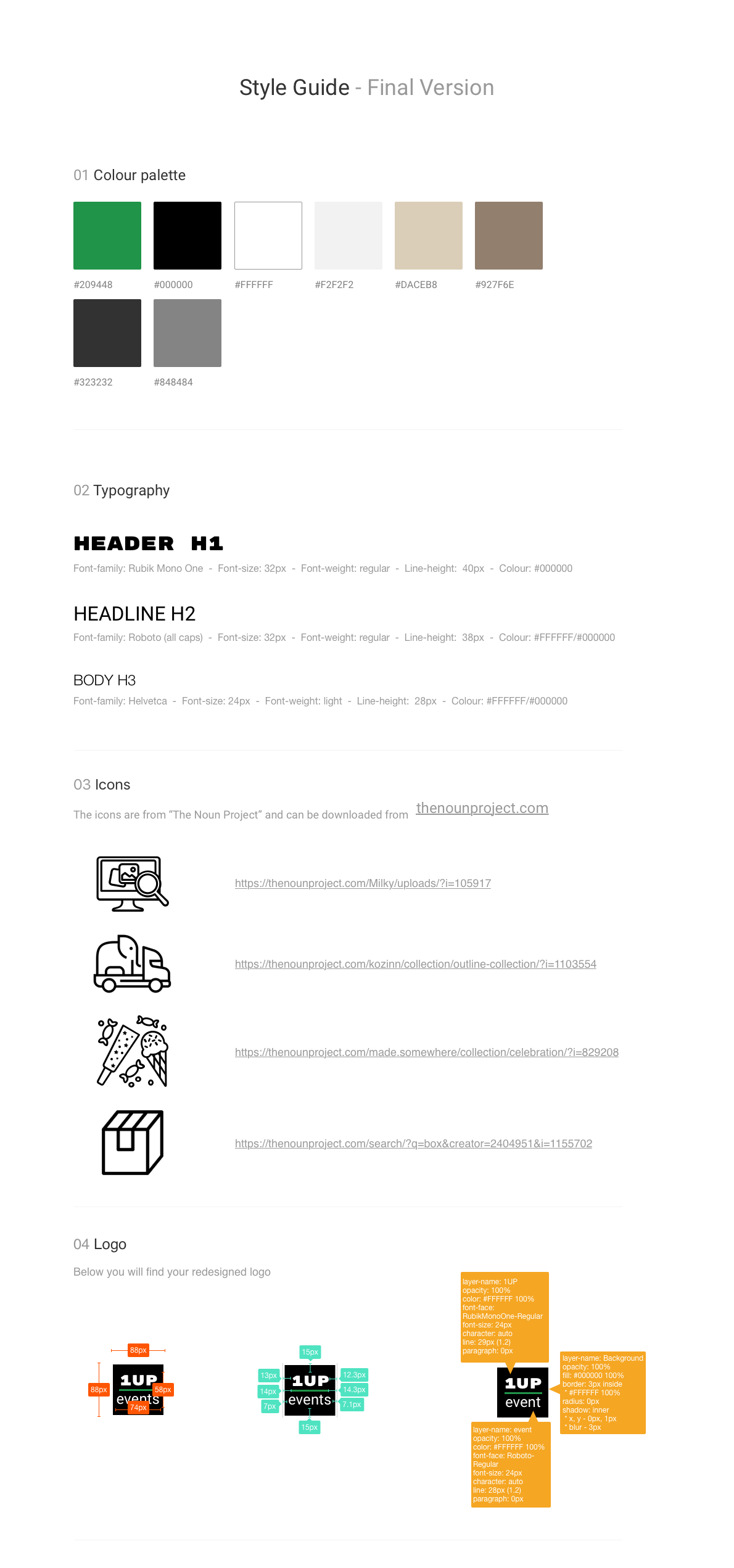
Style Guide
Tools
Sketch
Adobe Photoshop
Adobe Illustrator
InVision
Noun Project

Goals
“We want to make it easier to search & navigate the site in order to maximize user engagement & ensure that it is leading to an increase in bookings”

Business Goals
My client, 1Up Events, wants to increase customer traffic as their business and customer demand has increased over the past year. By creating a simplified, familiar check-out flow, users will complete the task of adding items to their basket and completing the whole checkout flow, leading to an increase in bookings.

User Goals
1Up Events is a new type of business model & many people did not even know a end-to-end service like this existed. New users were very engaged with 1Up Events & their product offerings, but they were not used to the new, transparent e-commerce model being applied to a product that traditionally requires time for quotes and booking.
Challenge
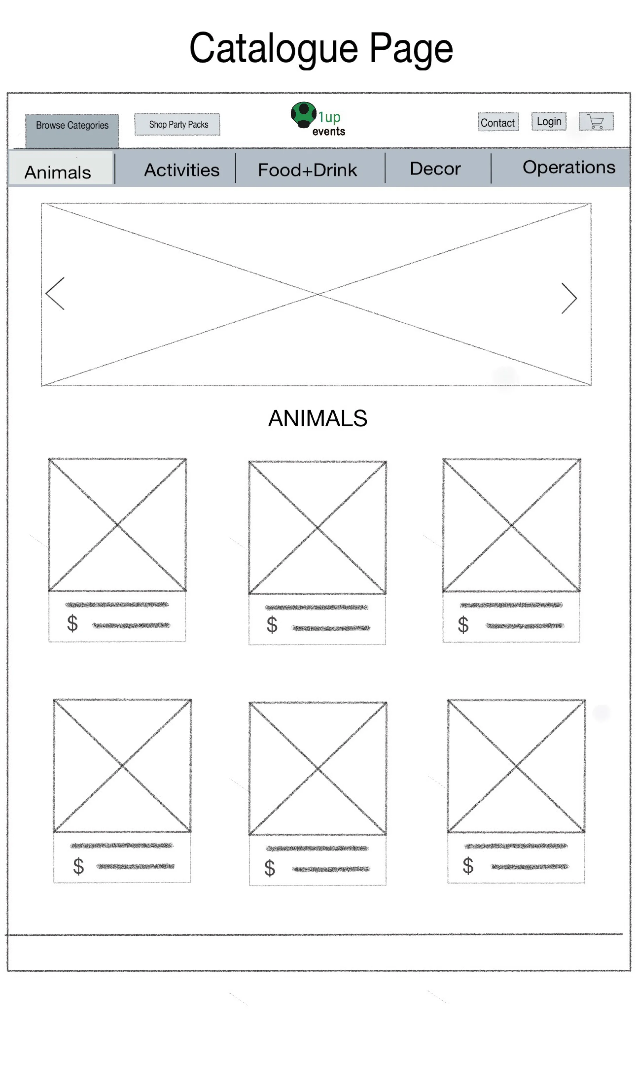
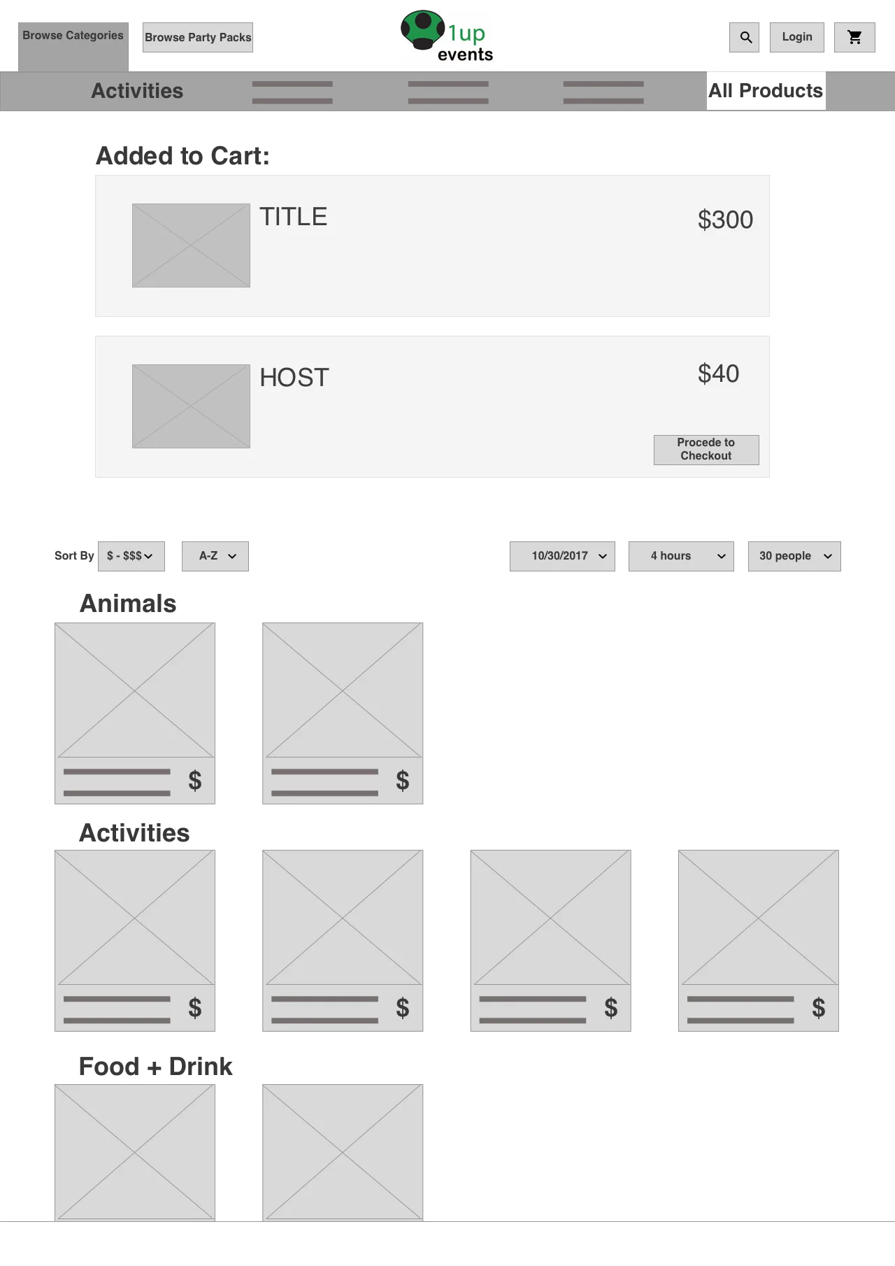
1Up Events product inventory has been rapidly growing over the past year, as they have over 350 different customizable product offerings to date & every day they are adding. This continuous expansion has lead to a very complex & confusing product catalogue, information architecture & site map. The biggest challenge in this project was identifying the base line products vs. the themed products, while also projecting 1Up's growth, in order to create the most logical & effective product categorization & user flow.
Research

interviews
Existing Users Love
Specific product customization
Transparent pricing
Option to add a host or book a venue

Surveys
New User Want
Clear & transparent product organization
Peer affirmation & assurance of reliability
Simplified website navigation

Usability Testing
New Users Dislike
Inconsistent pricing structure
Unclear product quantities
Confusing product categorization

Journey Map
Empathy Map
Competitive Analysis
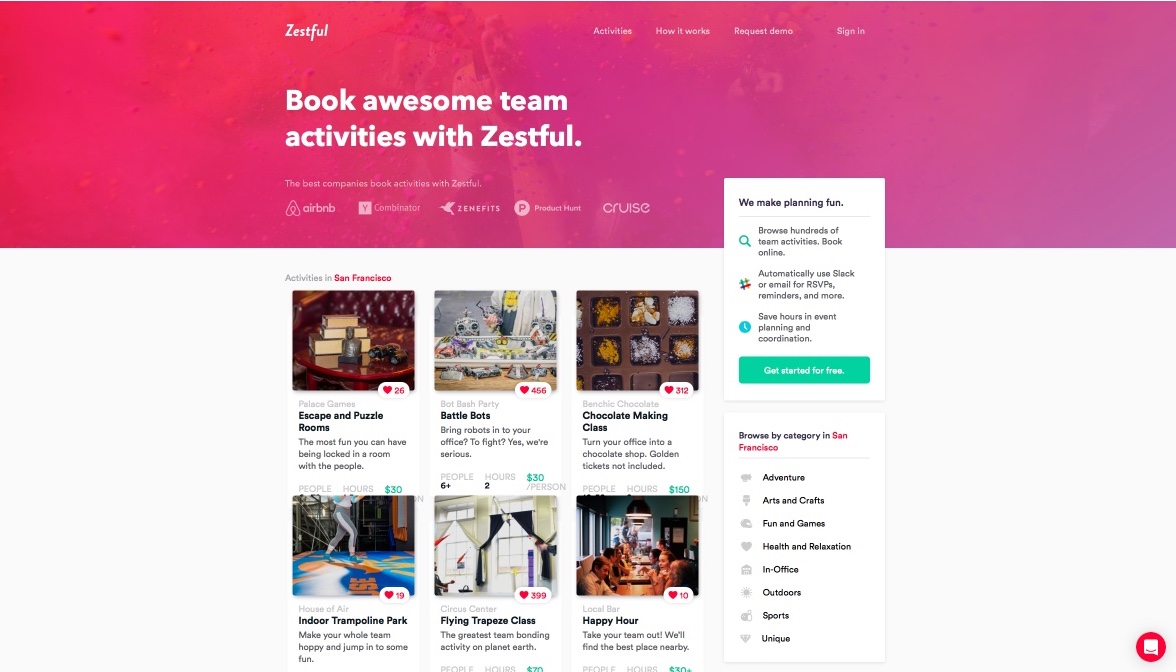
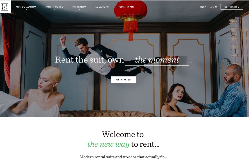
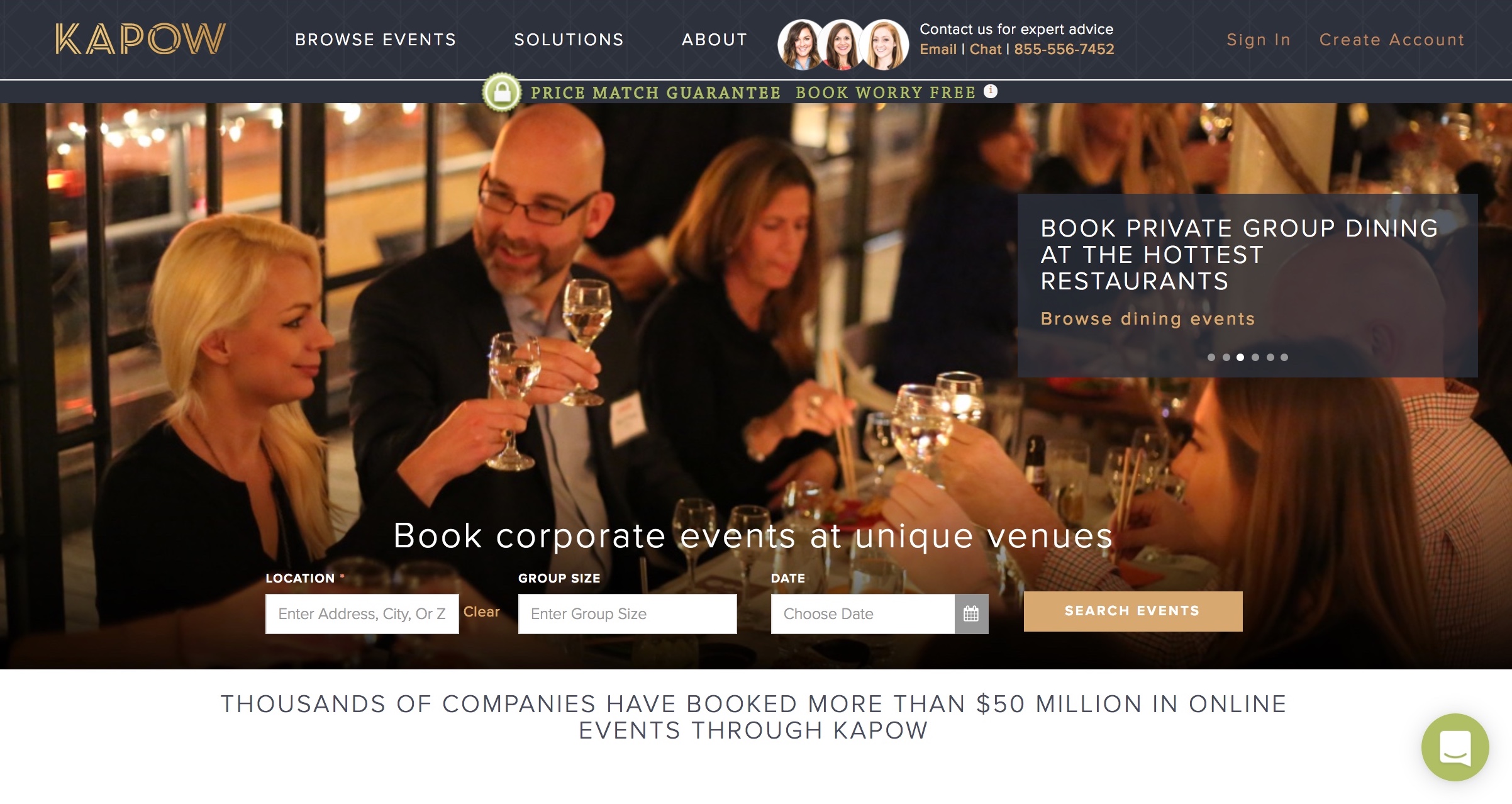
Based on feedback from user research, I began research on 1Up Events competition, specifically within the Bay Area, to see how their competitors in this unique niche of party planning were offering products to their customers. Our analysis extended to similar business competitors providing events online, such as Zestful, Kapow & Event Yoda, but I also explored other companies that successfully adapted an old business to an 'on demand' e-commerce platform, such as The BLK TUX, Breather & Postmates. Through competitive-comparative analysis we examined the competitions type of business, featured product, target audience, Navigation Features, Slogan, & their Price Point/Pricing Structure.
Design
Primary User Flow
Design Iteration
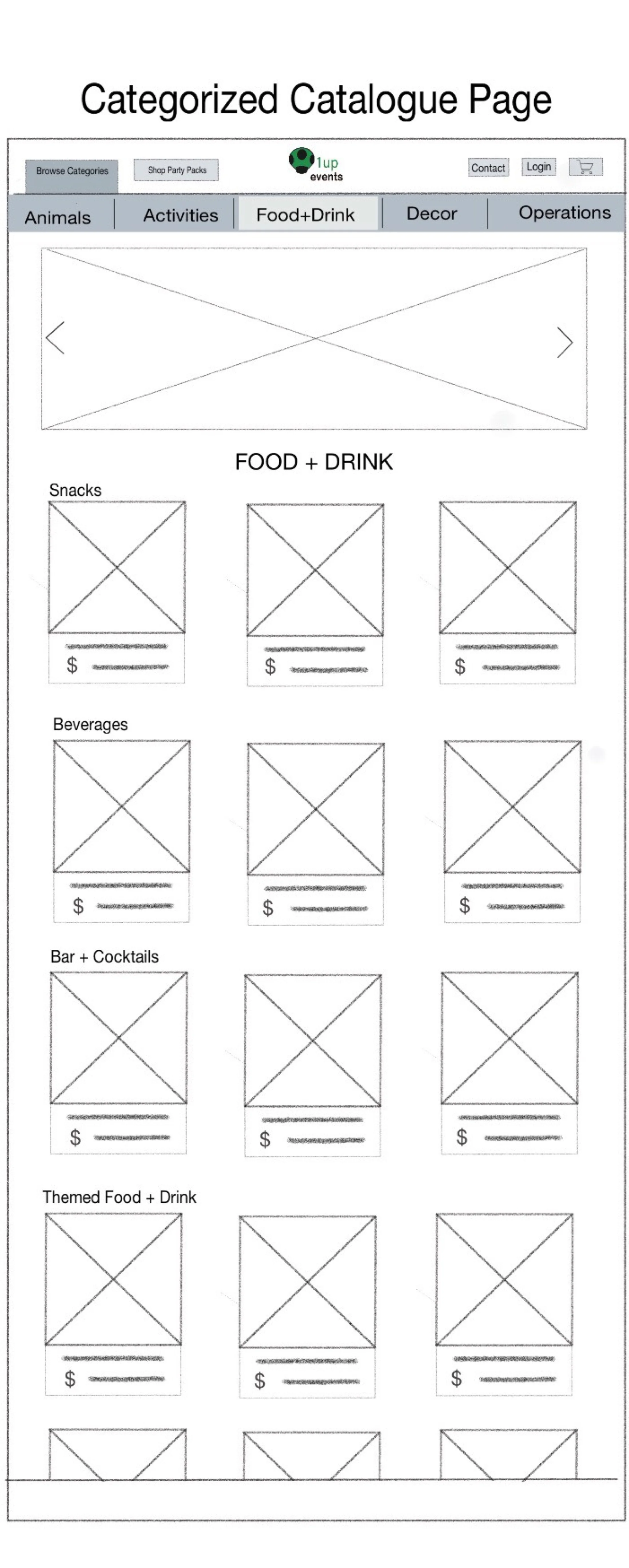
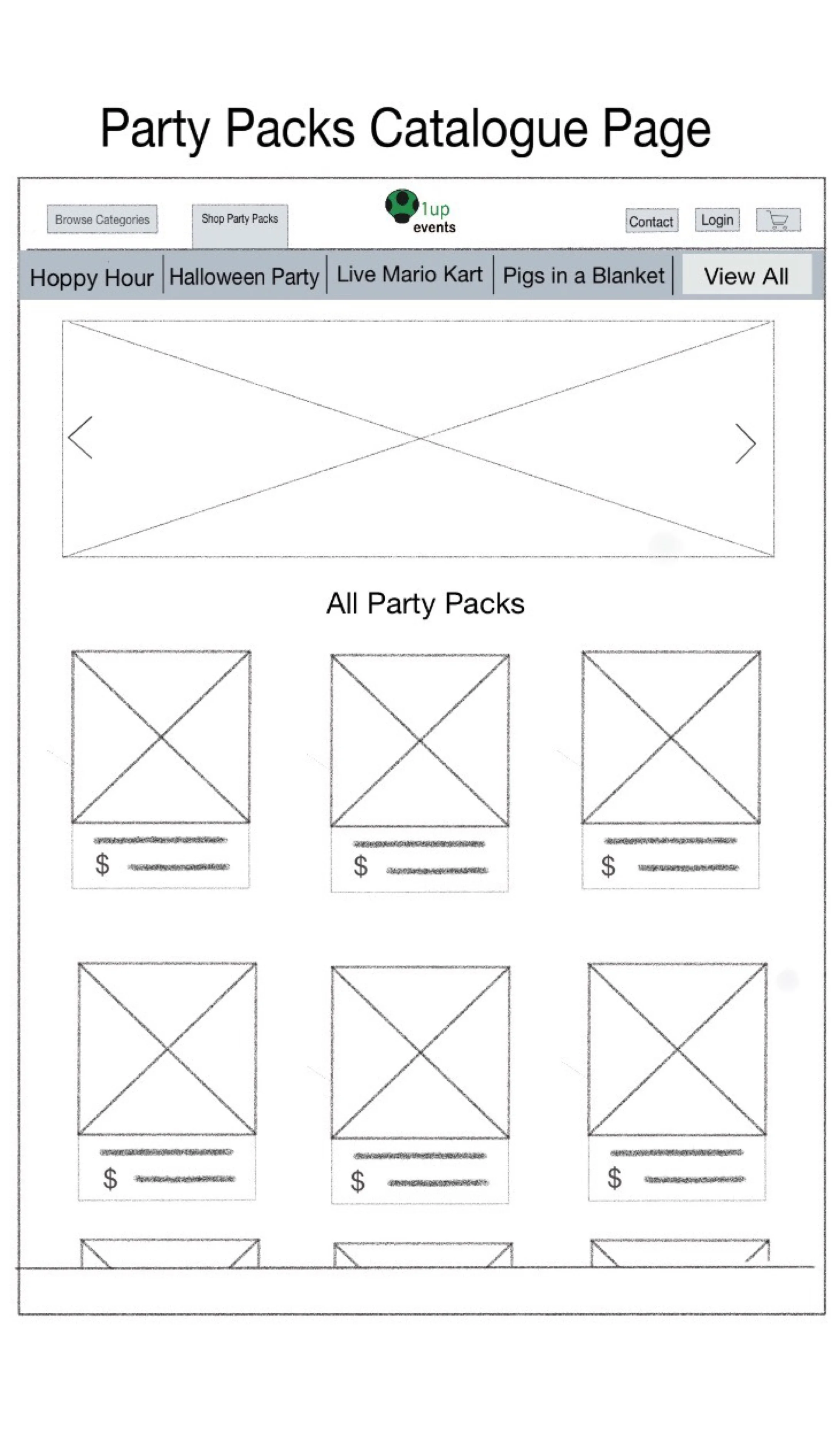

Step 2: Wireframes
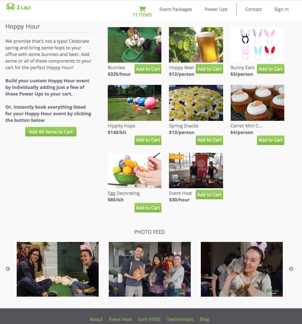
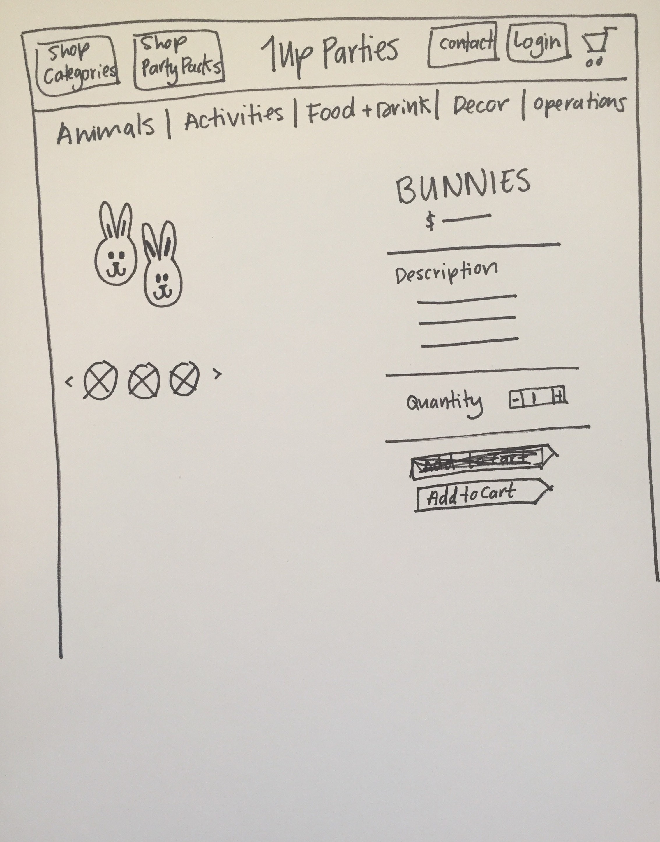
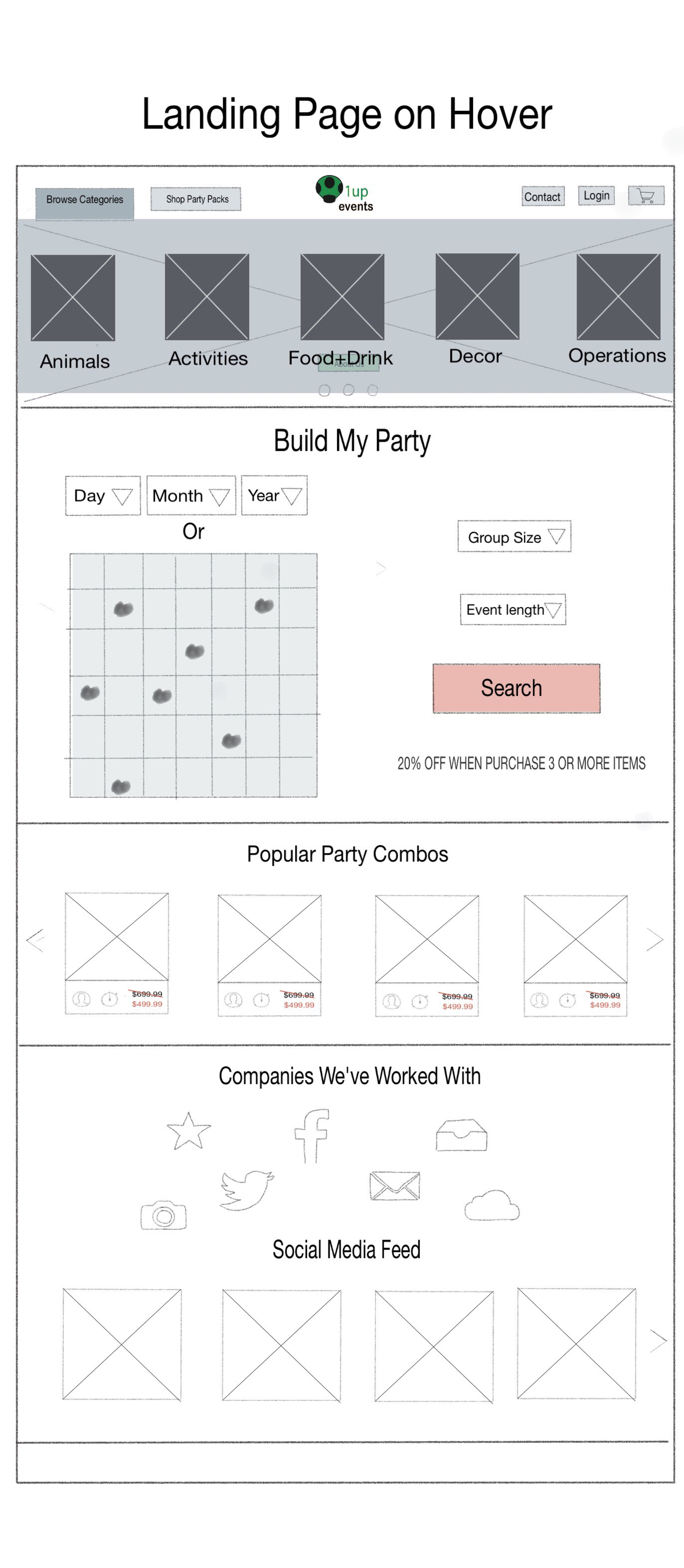
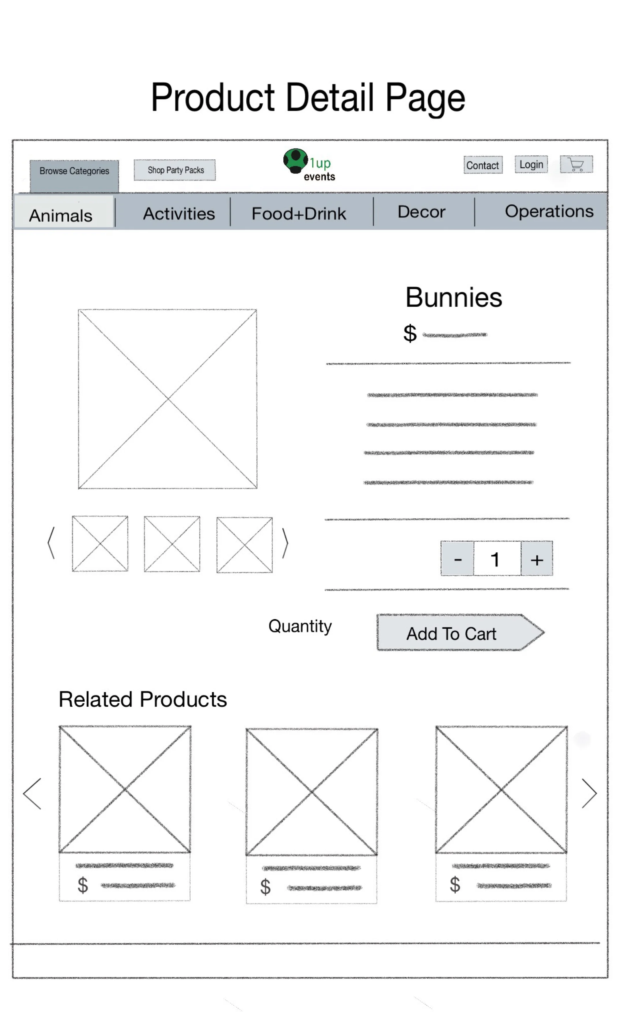
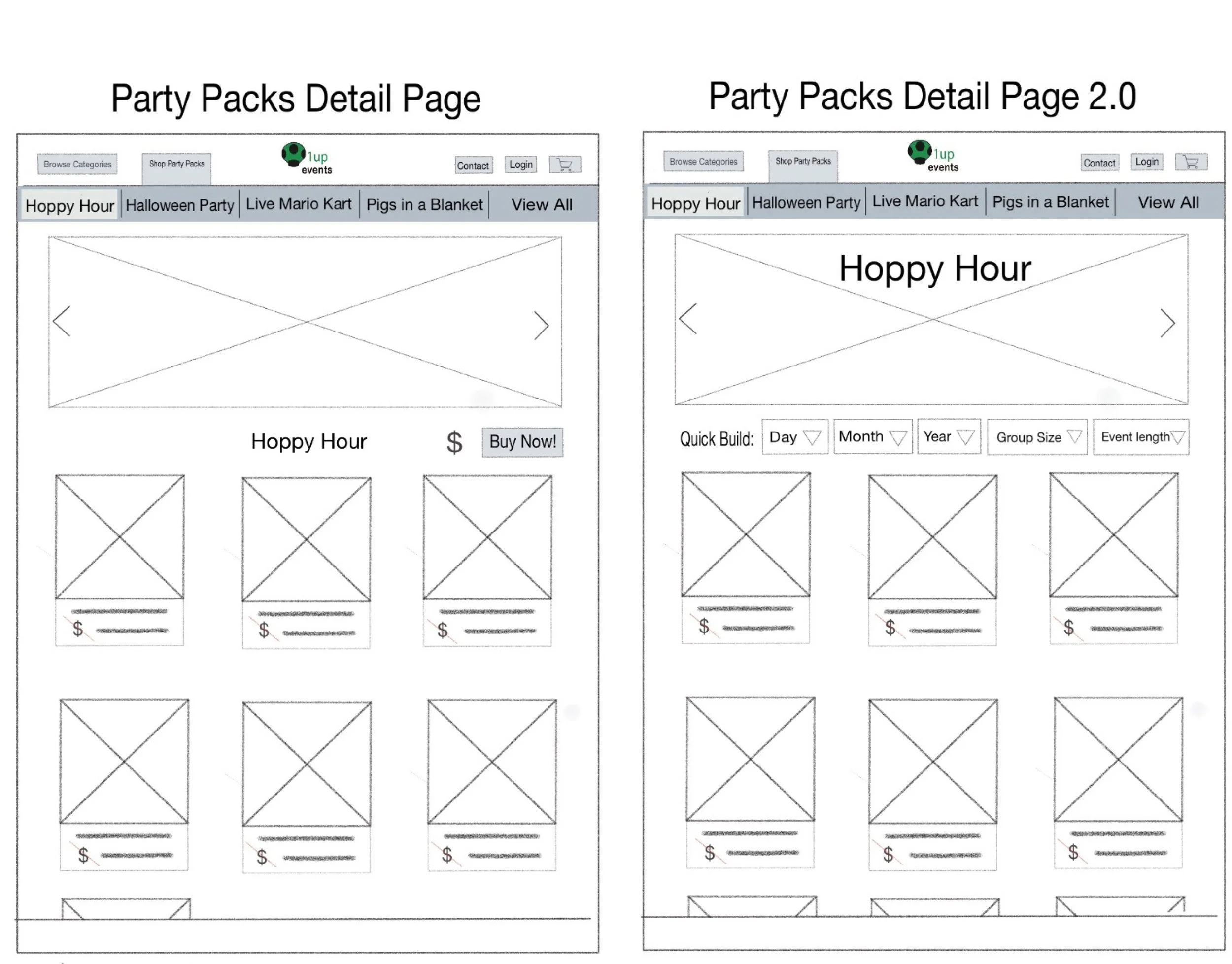
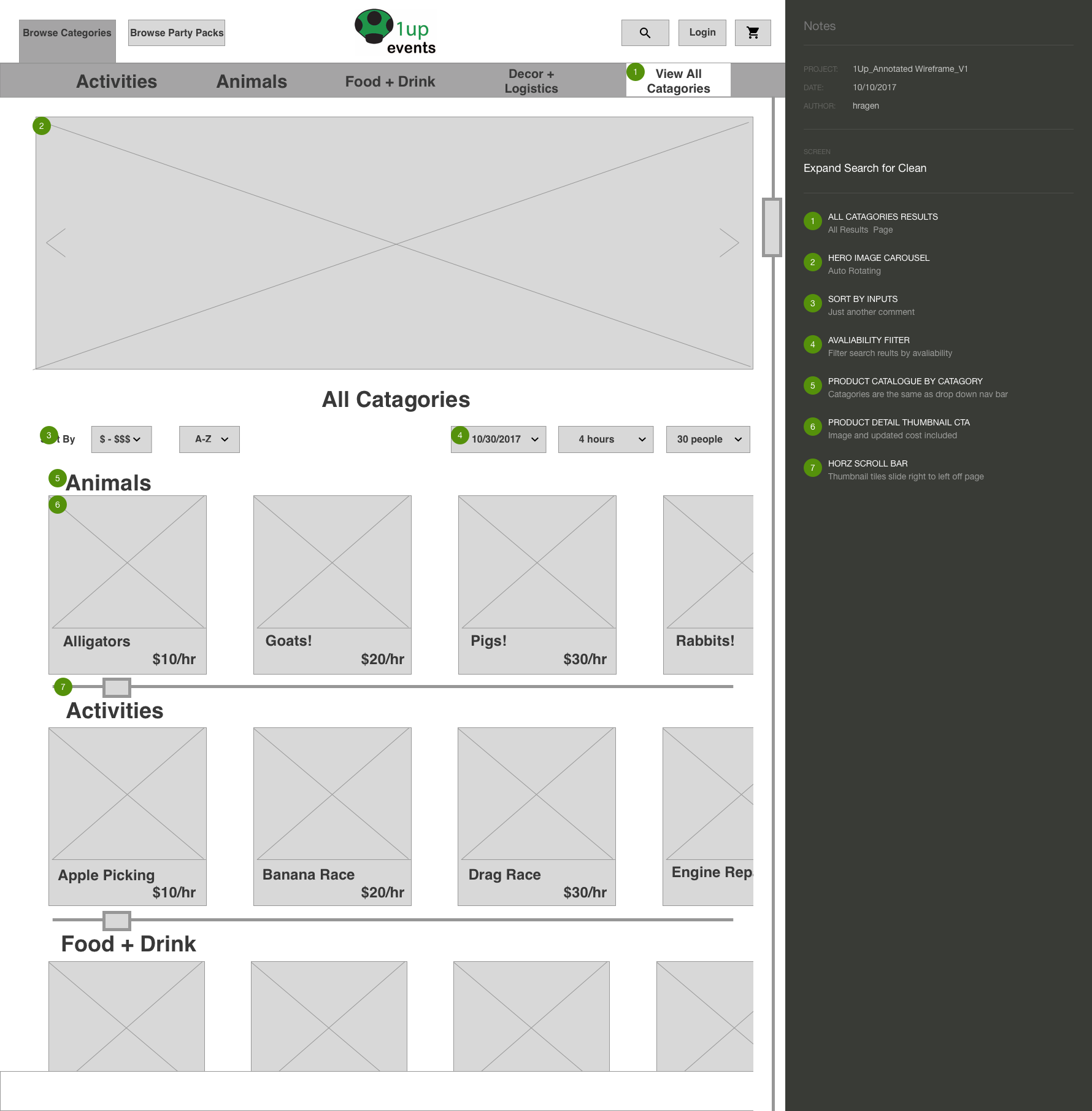
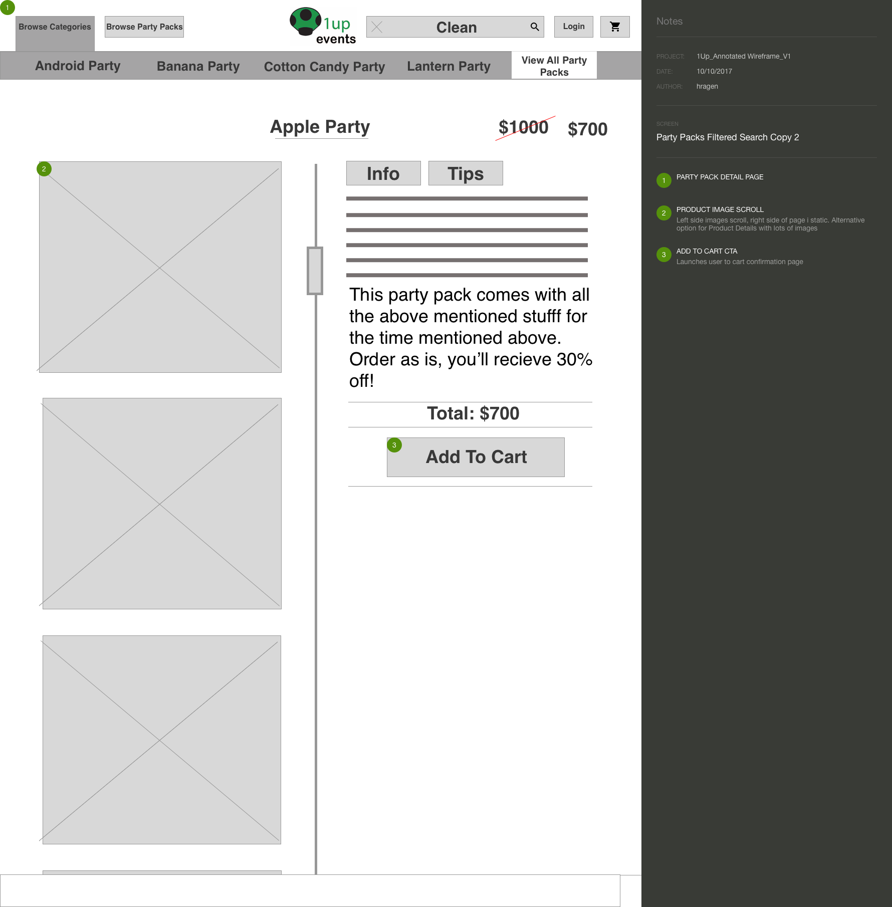
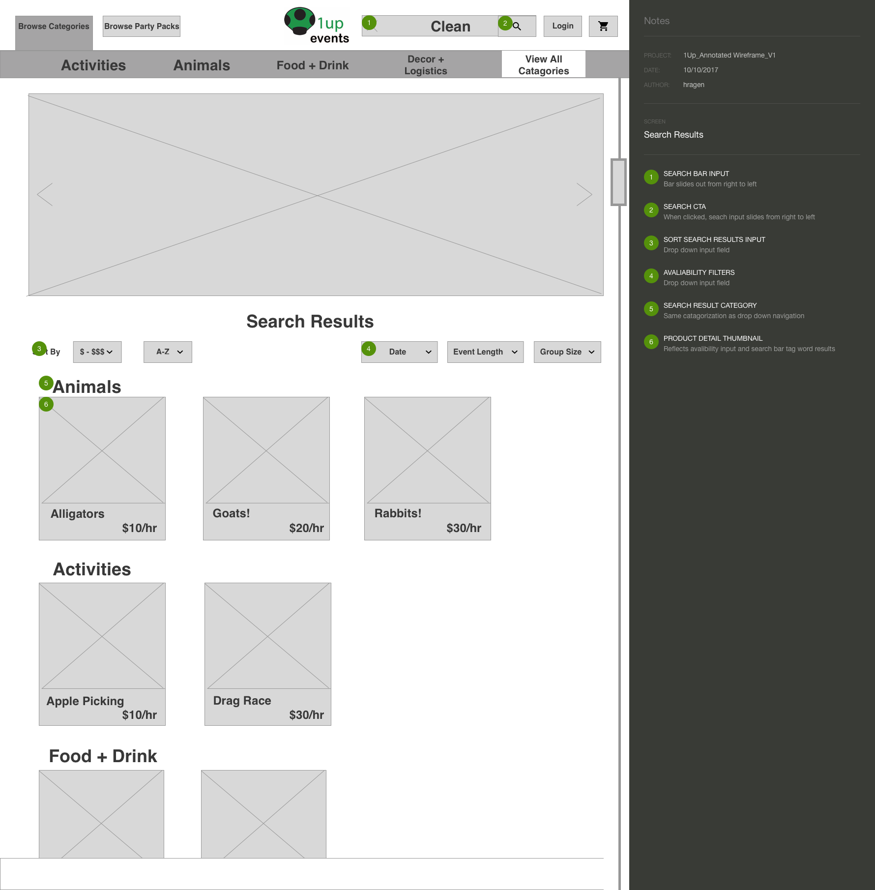
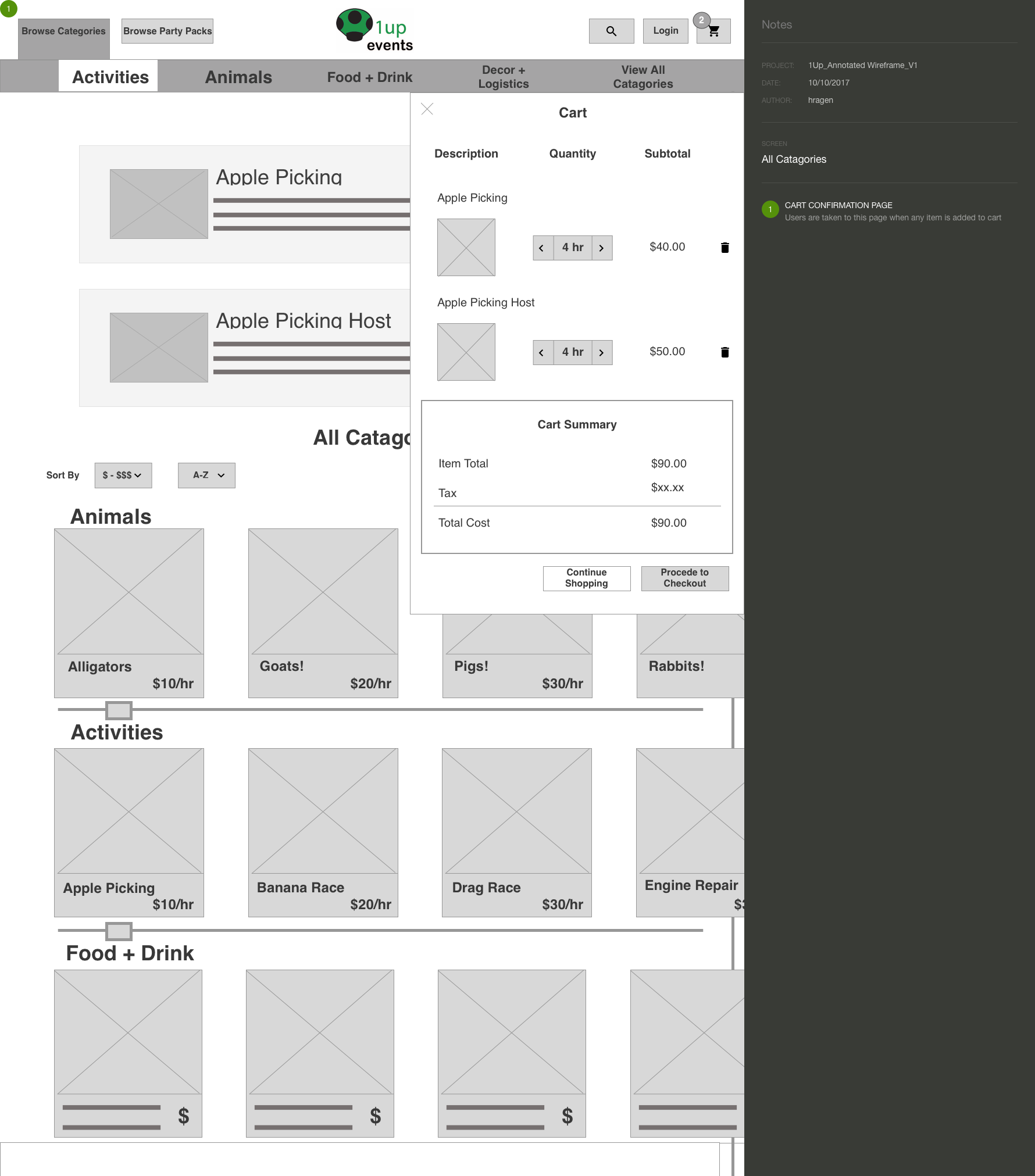
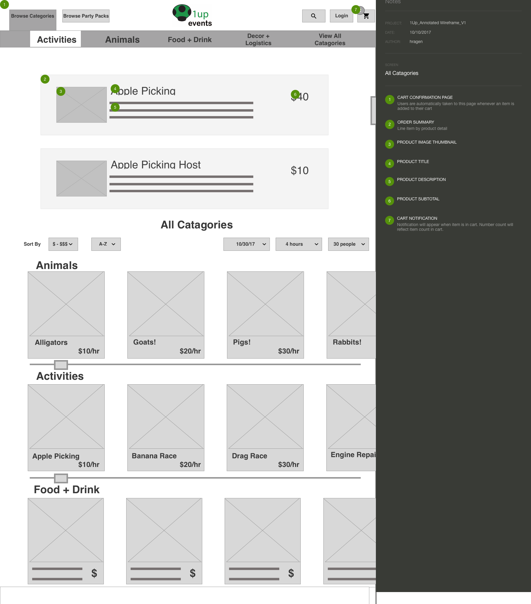
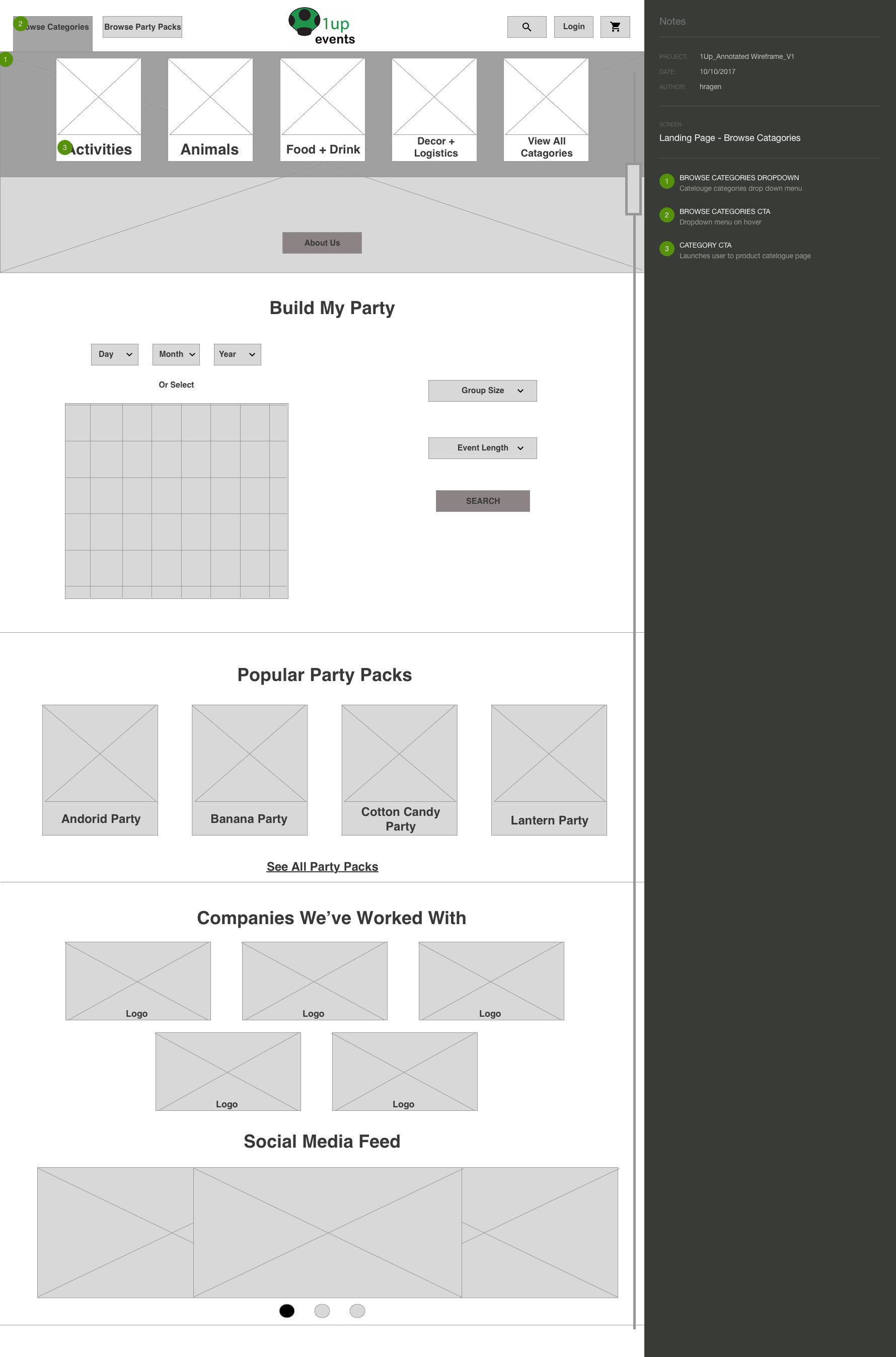
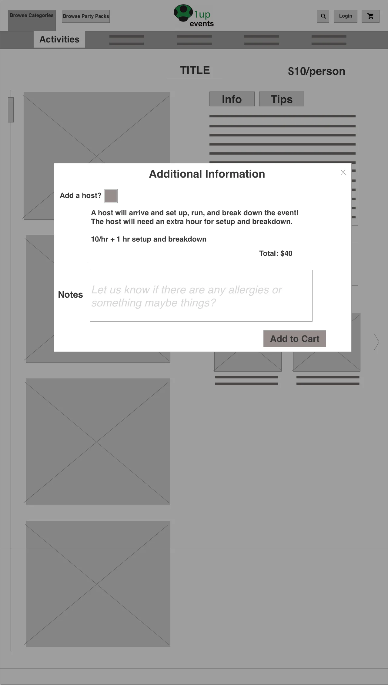
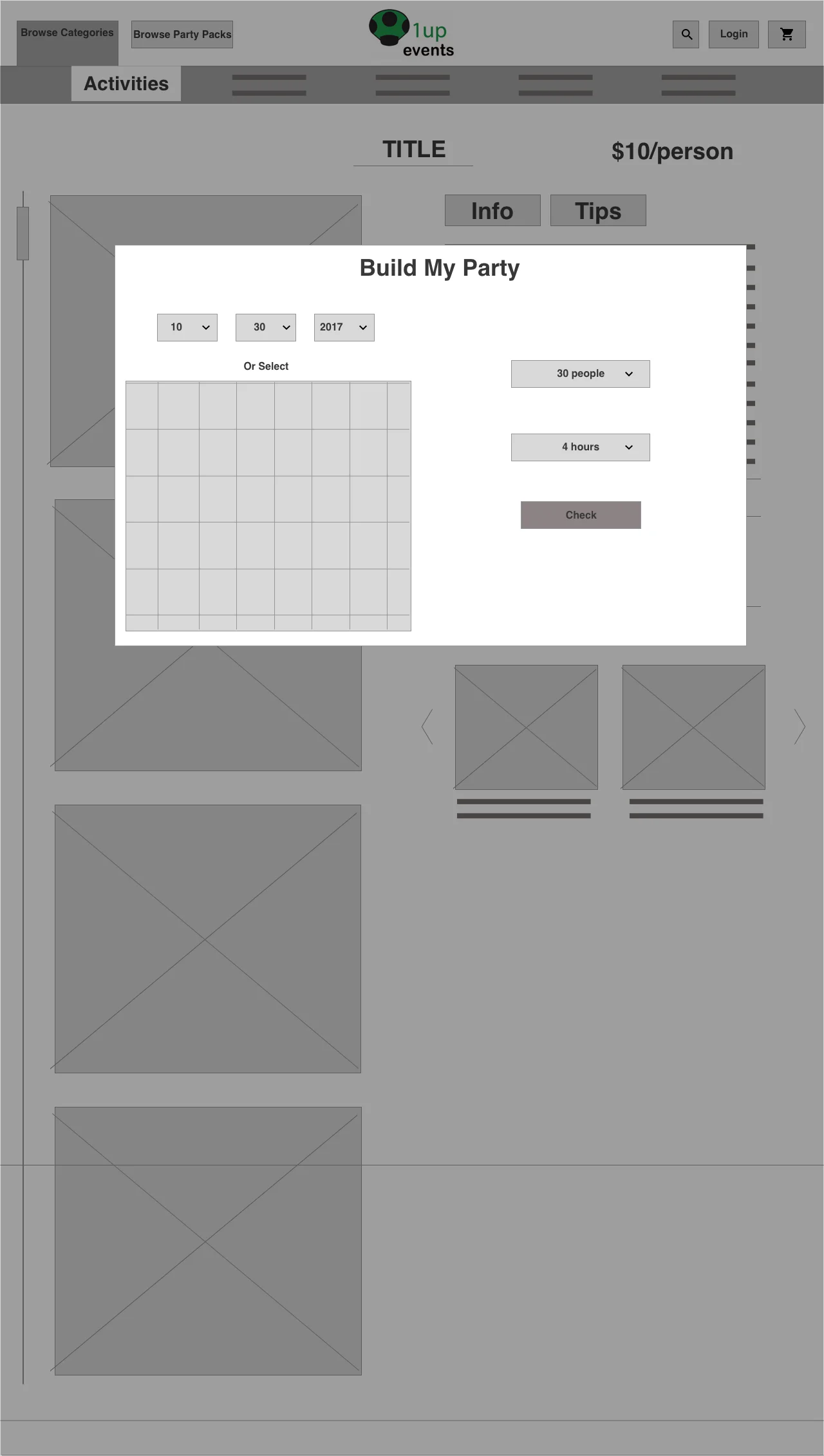
Once the skeleton of our primary user flow was established, I began creating mid-fidelity prototypes for usability testing. This phase of the design process was very important to the iteration of the product detail page. Through usability testing, I developed a simple "availability" module that becomes part of the check-out flow on every product detail page.

Step 4: Specification Documents
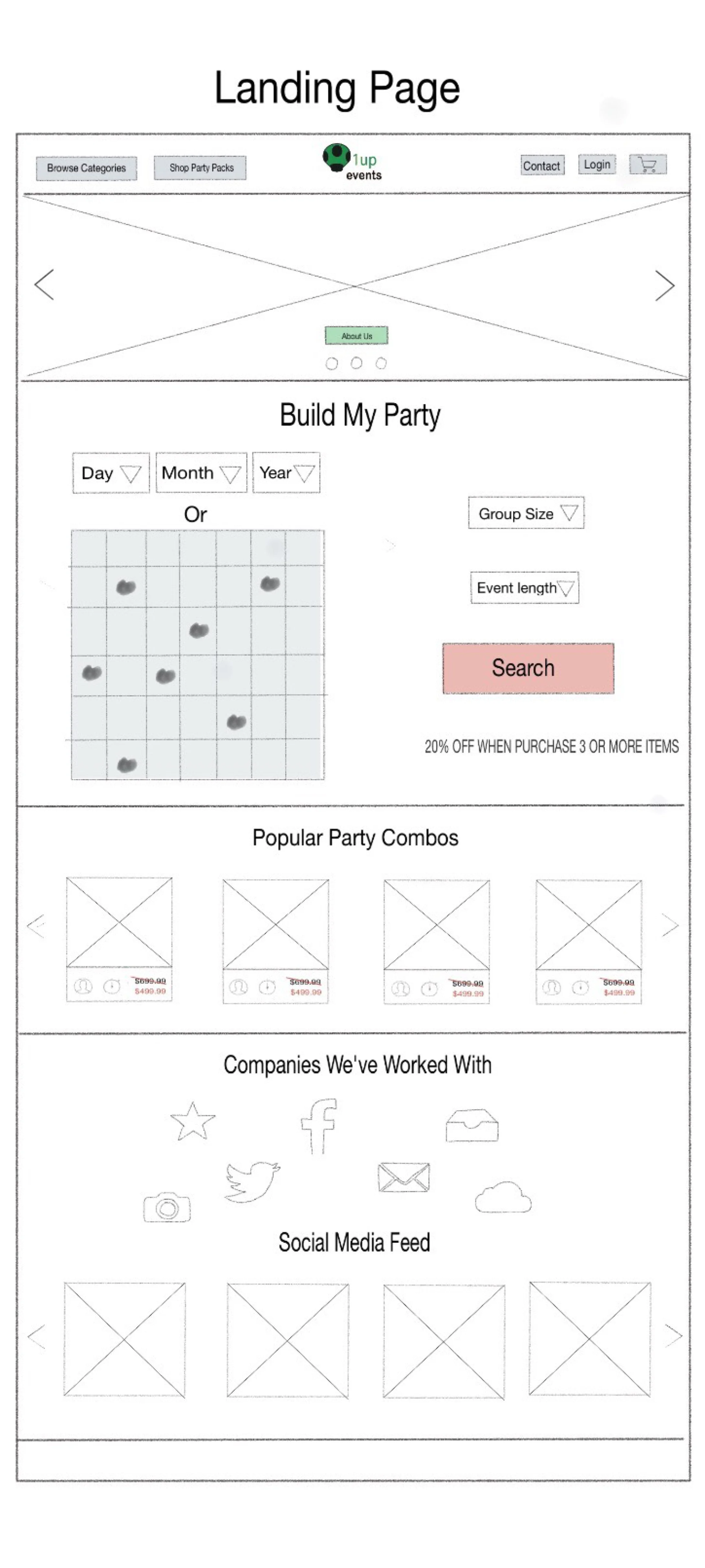
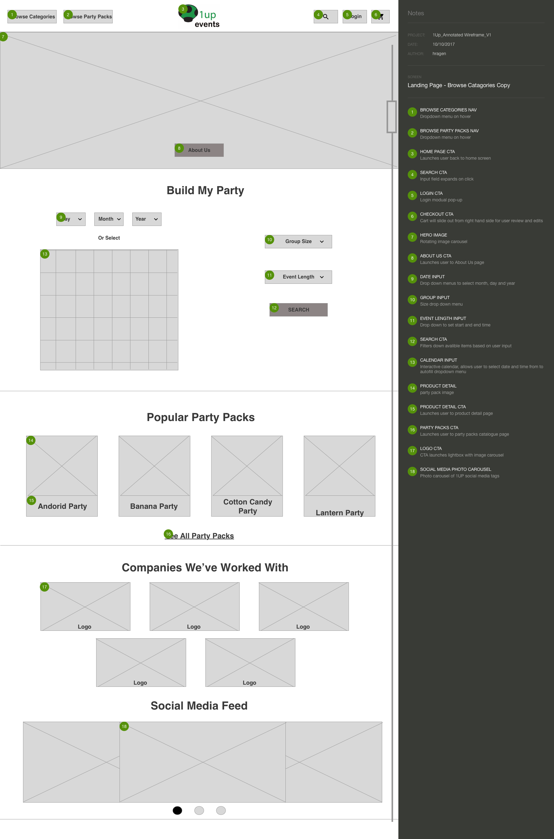
1Up Events is young, growing start-up, as they are developing & drafting their business plan & mission statement today. I provided my client with the beginnings of a basic style & a mock-up of the landing page in order to begin to think about a compelling visual interface & company image.

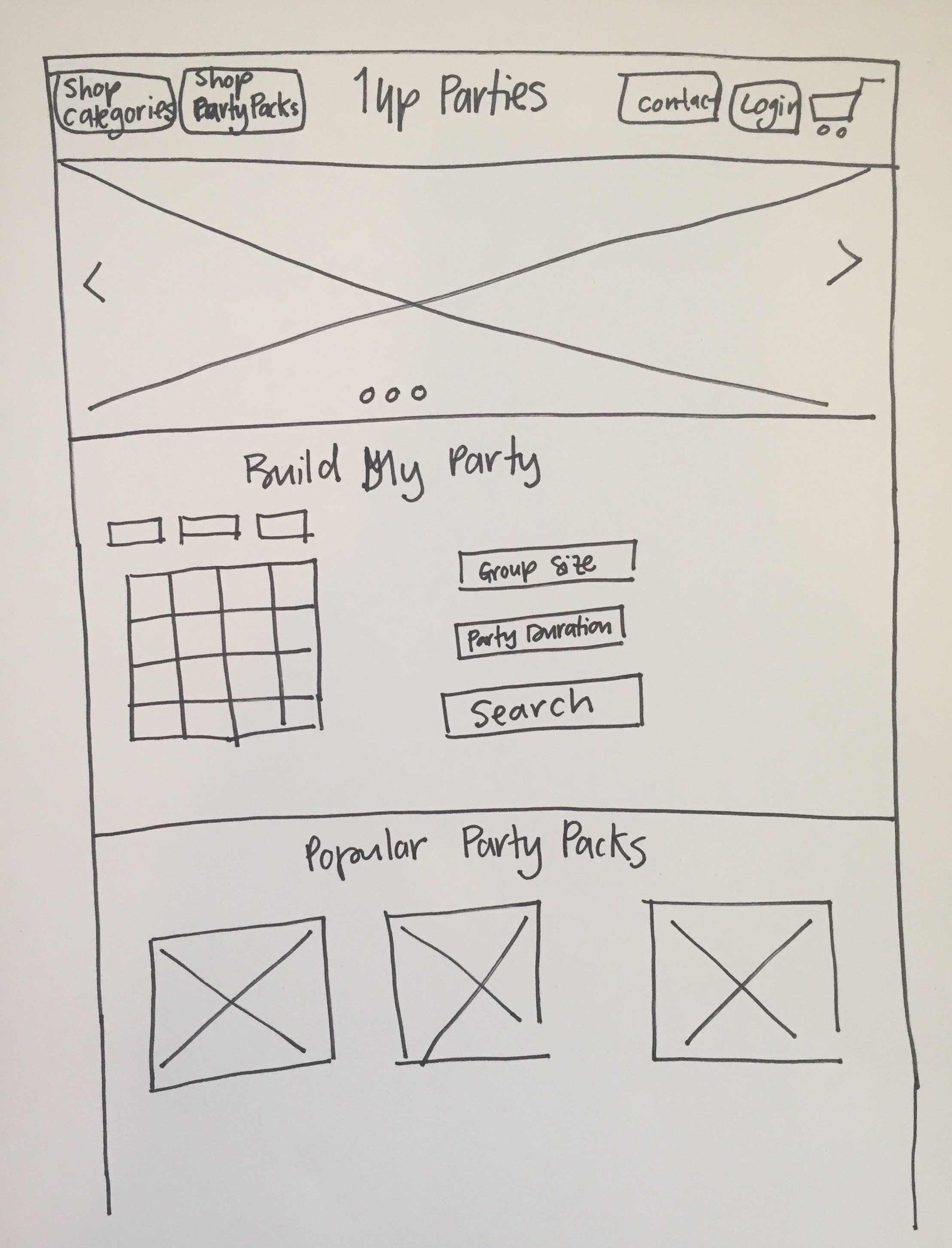
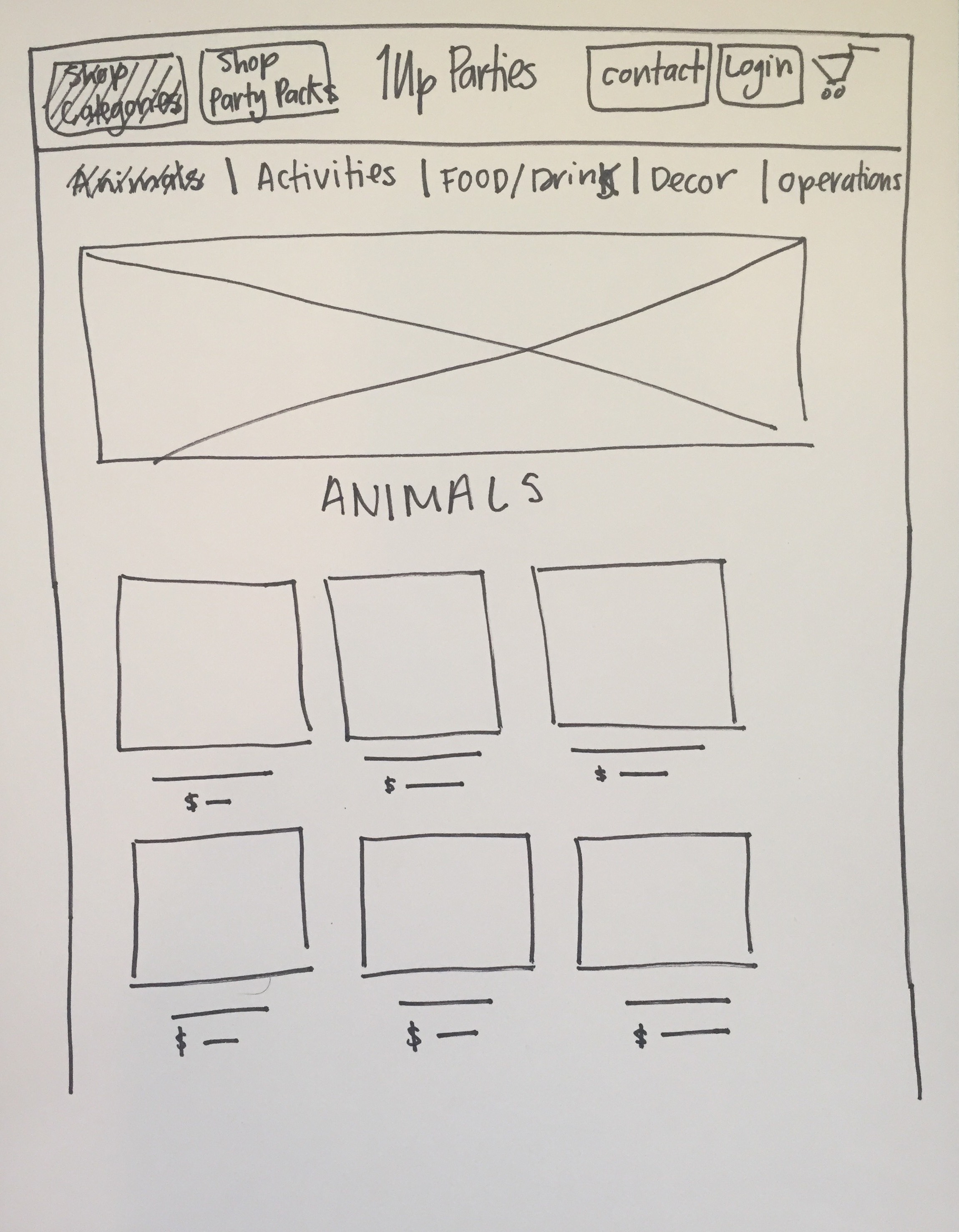
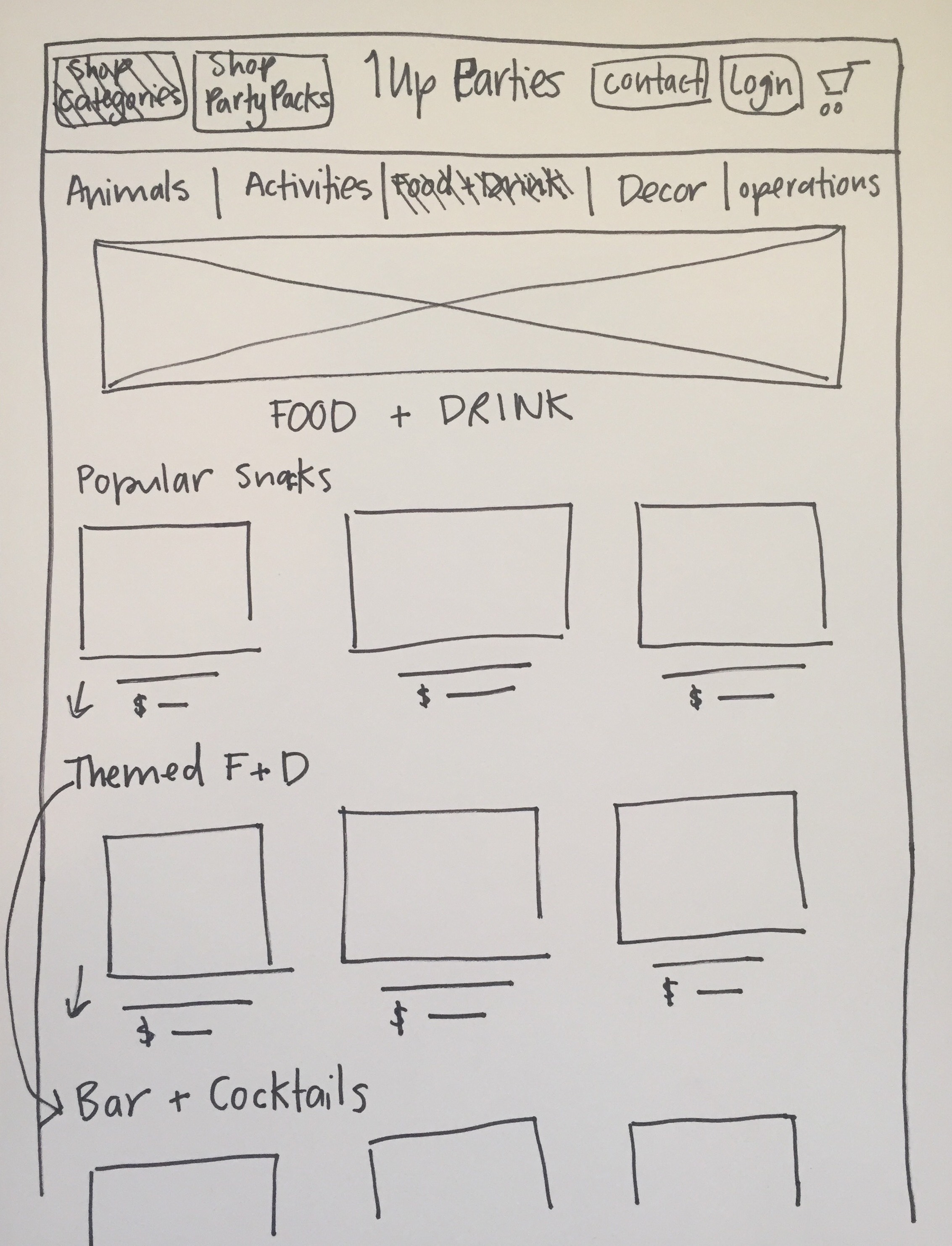
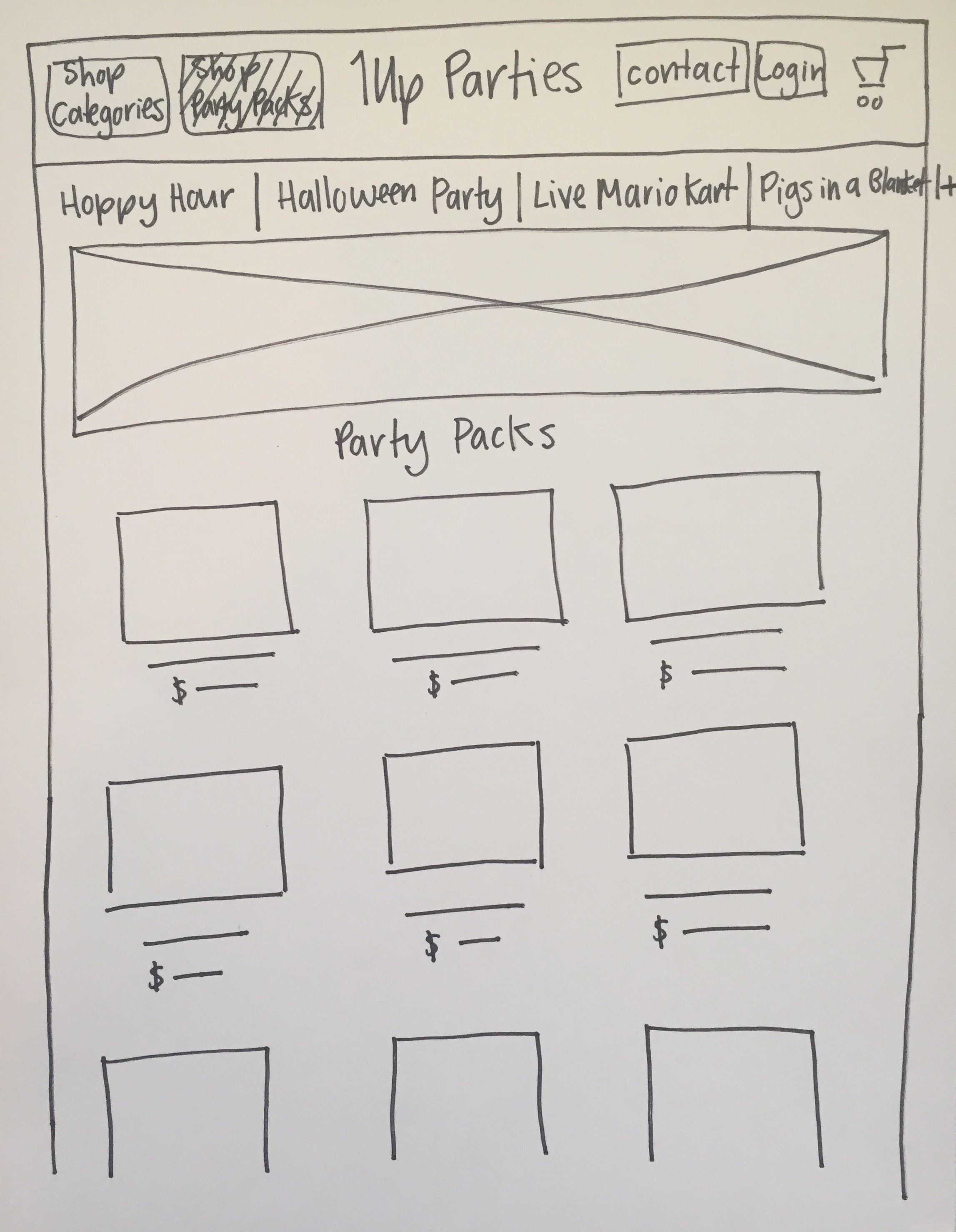
Step 1: Sketches
I began initial design ideation with pen & paper. Through many hand drawn versions, I managed to establish a user flow & site map for the website redesign. Upon agreement of these flows, I took the sketches to a digital platform in order to present them to our client to get our first sign off.

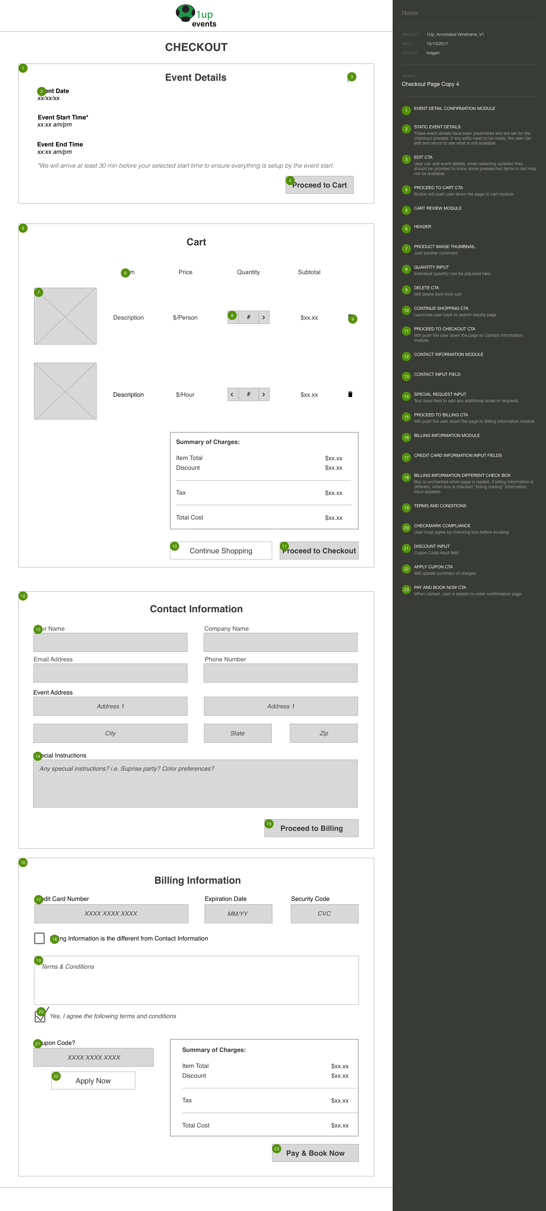
Step 3: Annotations
The interaction annotations are very important to the "availability" light-box module, as it became the first step in our user flow before products can even be added to the cart. Additionally, the module CTA appears on every page & the functionality changes depending on the products availability.
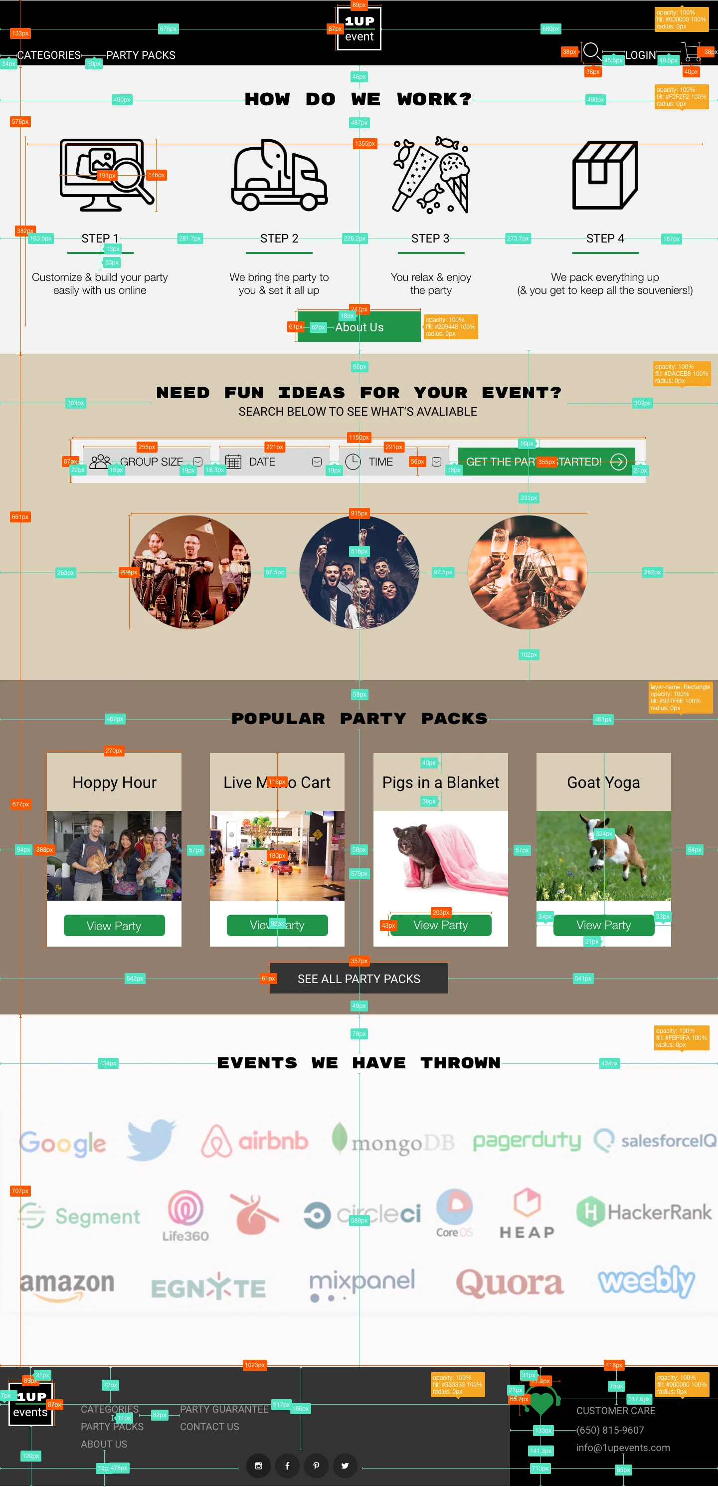
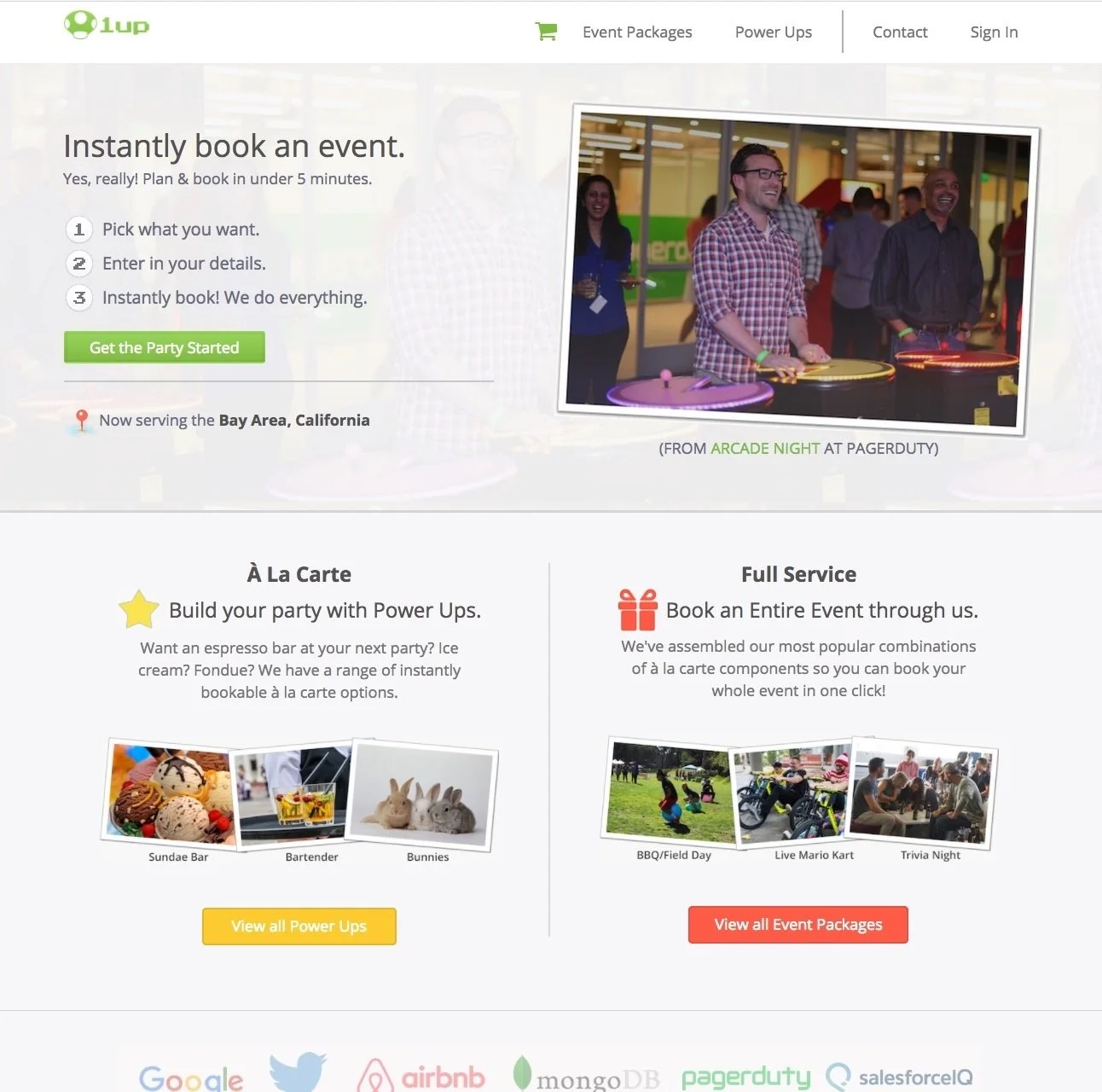
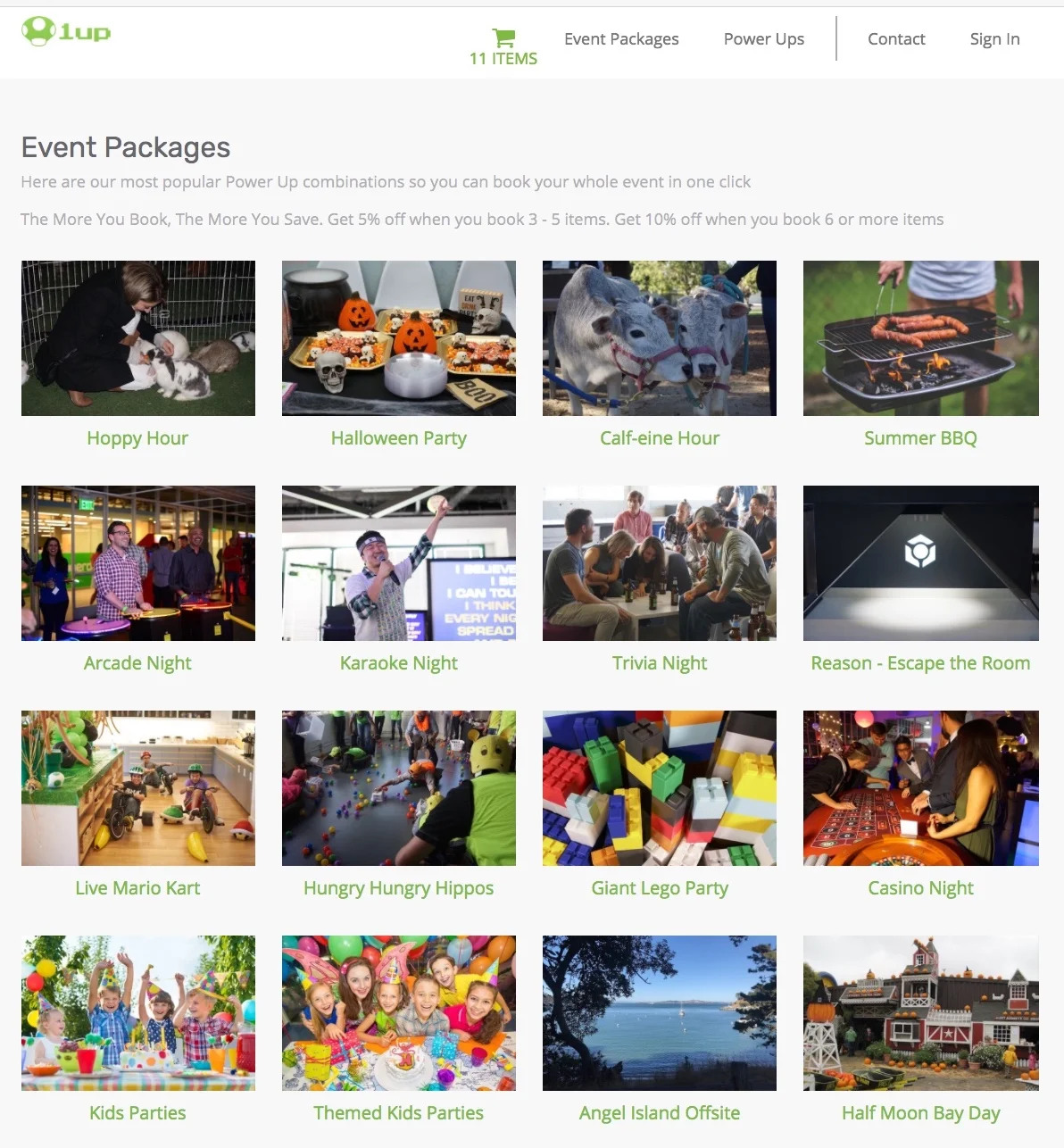
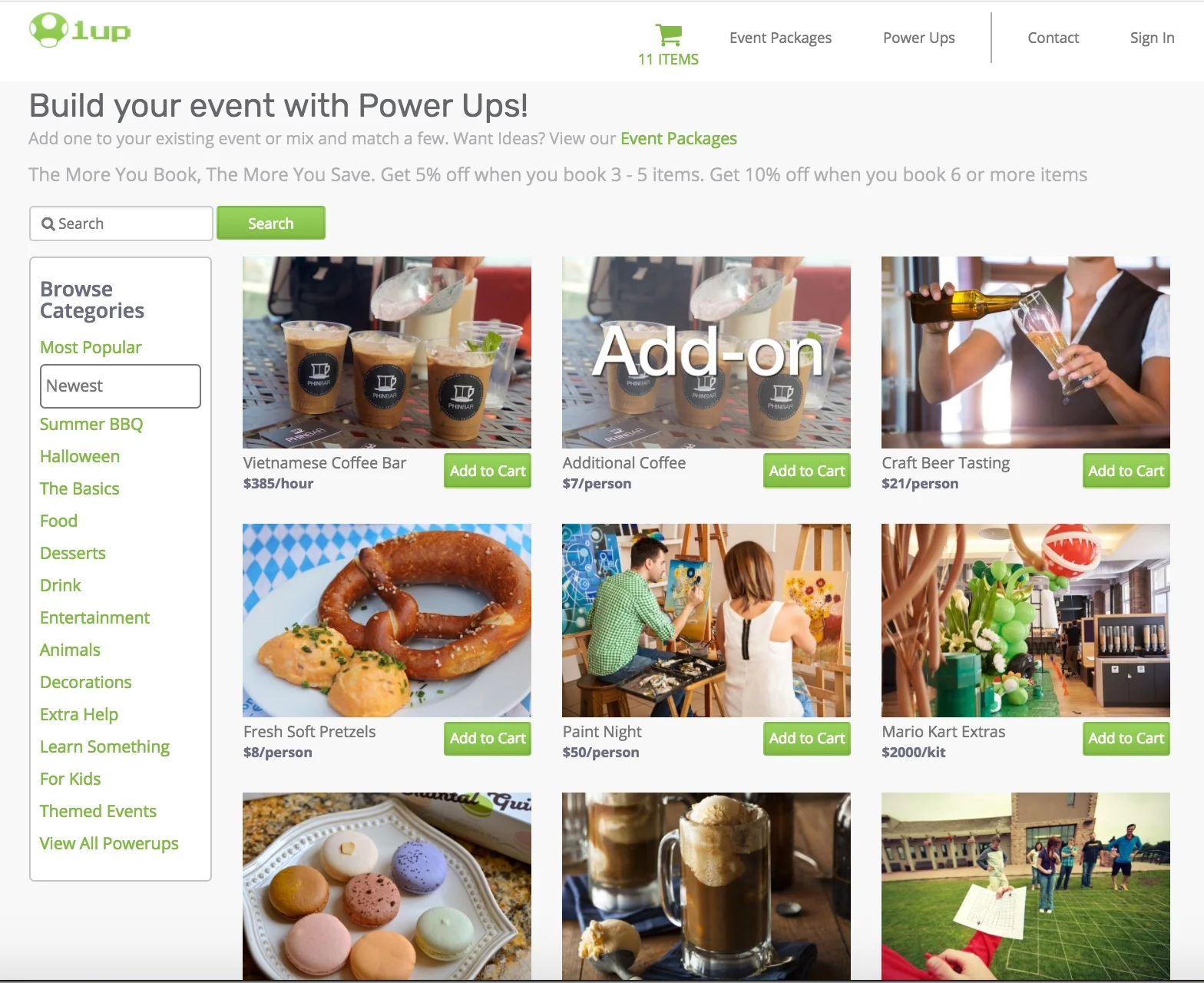
Final UI
Moving Forward
Besides great UX Design, in order to create an amazing & unique user experience, our client must work on developing the following in order to have a strong web presence:
Develop a company mission statement, branding & copy
Build a strong & inclusive social media following
Update product tags & expand categorization
Streamline & simplify product pricing structure